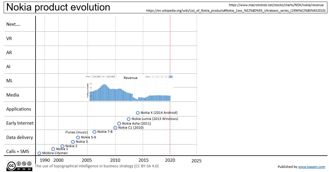
This is not a Wardley Map, but a graphic representation of the products commercialized by Nokia during last 20 years.
I have classified them by major software type of technologies, simplifying it too much.
I’m not taking into account the hardware and semiconductor technologies that they really are so much important, and the reason to do it is that I wanted to focus the analysis on software technology giants.
Nokia serves me as reference, so once you see the other graphs, you can compare.
 On the chart you can see:
- Product evolution of the main families of mobiles that Nokia sold.
- You can notice how they jumped from their own OS to Windows and then to Android. These moves meant to Nokia a huge effort to keep themselves into the competition.
- The chart in blue is the revenue from 2005 (I cannot obtain more years from macrotrends.net).