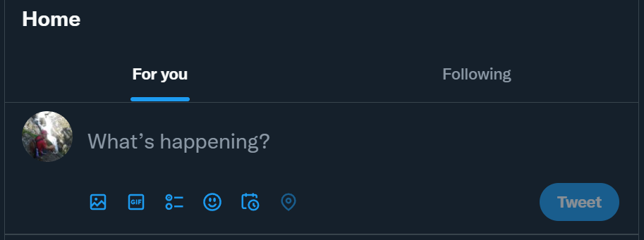
During these days, the header of twitter’s users have a new space where they can see something like this:

By default: “For you” that is a mixture of your followers content plus recommendations done by Twitter.
On the right “following” that by the moment, it seems to contain the timeline that Twitter users are used to see.
I do not you, but it took me a while to see it on the computer. The way that is shown in the mobile is different.
There are many news about this change. For instance: The Verge, Pocket-Lint….
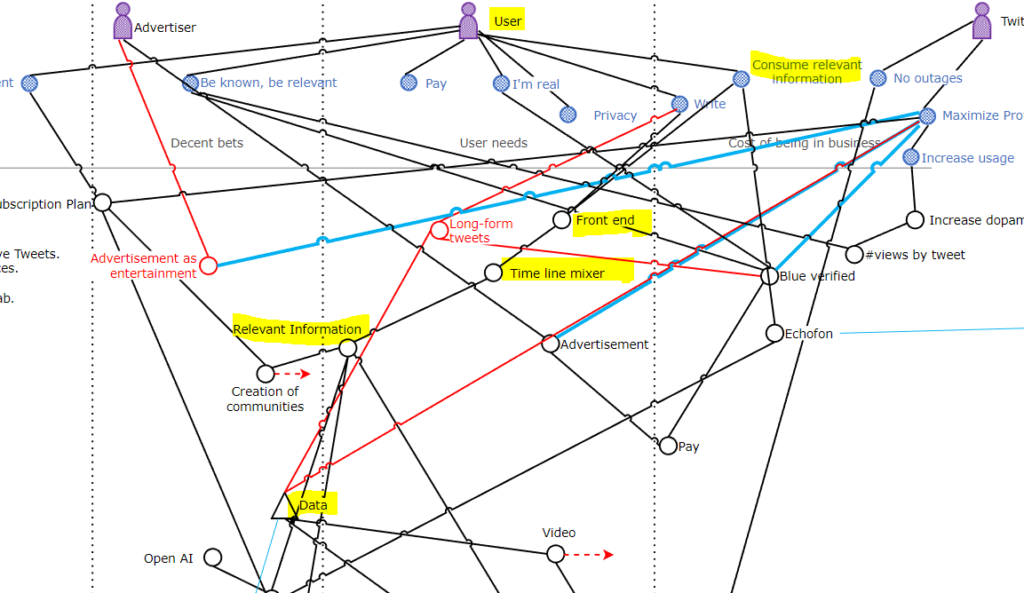
Update to the Wardley Map
The last version of the map draws the value chain considering a “good faith” behavior by Twitter, and being shown as follows:

The assumption of “good faith” where Twitter was going to offer more relevant information was very naïve and now the direction is to offer by default a timeline that looks like more like the LinkedIn timeline or even worst: the Facebook timeline.
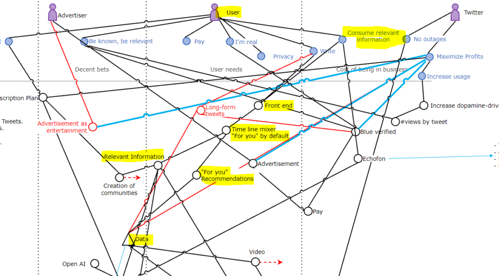
The irony of “for you” is that in reality is “for them”, “for Twitter”….
The updated Wardley Map is this one:

What will be the next move?
I have no idea, I’m looking at this from outside and I lack information about what’s cooking.
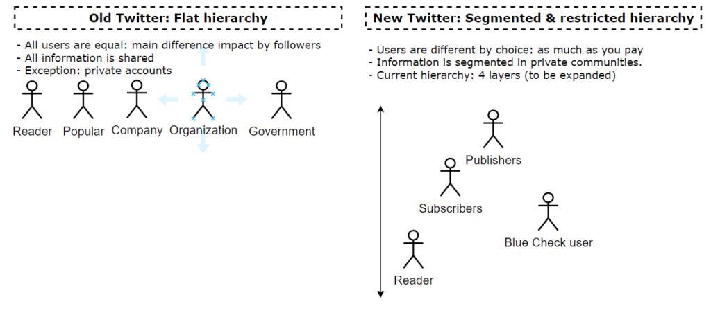
In any case, looking at the gameplays being used, in terms of data, and user segmentation, I would not be surprised if the “Following” option is something that is part of the user segmentation strategy, where users have to pay to access to “relevant information”.
