When the US stock market began to fall in the spring of 2020, the Federal Reserve (FED) announced a stimulus plan of about 2.3 trillion dollars. The press called it a “liquidity injection from the Fed.” Interesting concept, money injection.
But how is liquidity injected into the market? How is all this executed?
Permanent Open Market Operations (POMO)
POMO refers to when the Fed (or any central bank) constantly uses the open market to buy and sell securities in order to adjust the money supply. All these operations go to a portfolio called: “system open market account” (SOMA), which is, in a nutshell, the FED’s portfolio.
This mechanism and these practices have existed for decades, but depending on the moment they become more noticeable or invisible.
When does the Fed buy?
I do not know knows, at least I have not found out, what the FED buys, that is if there is a calendar of purchase days and the estimated quantities that the FED intends to put into circulation. The calendar looks like this:
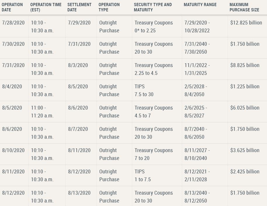
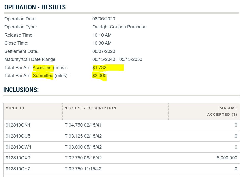
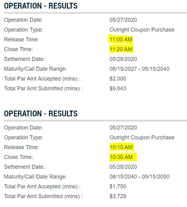
It is important to understand how much positions they open and finally how much are completed (since not all trades are ccompleted). On this page you can see the data of operations launched and executed:
Several purchases a day
As can be seen in the image below, the situation may arise that there are several shopping packages per day, such as May 27, 2020. During the worse days of the market they were opening 6 or 7 packs of operations per day.
What is happening this spring / summer of 2020?
Well, a lot is happening, but focusing on POMOs, what is happening is that there are many people looking at this data and operating based on these money flows (considered “free” by some specialists).
The general opinion is that there is a correlation between the money that is put into circulation by the FED (the daily injection). With this, on the day before a liquidity injection there are people who operate in certain values seeking the rise of the day of the “big injection”. How do they operate and what do they operate on? … well, I don’t know.
I am trying to get data and draw it to understand if this correlation exists or is a simple bias.
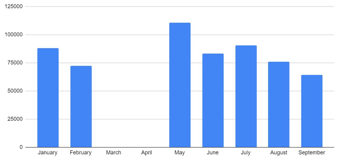
This graph is the only interesting one I found but it is from previous years:

Regarding 2020, the only graph I found is this, which doesn’t tell me much:

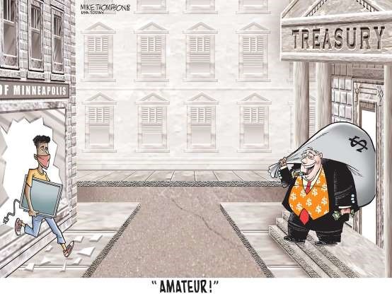
All this “free” money plugged into the market has made many rich, and at a time when COVID-19 has been affecting the economy in very significant ways, Wall Street is doing its own particular August.
This vignette summarizes very well what has happened:
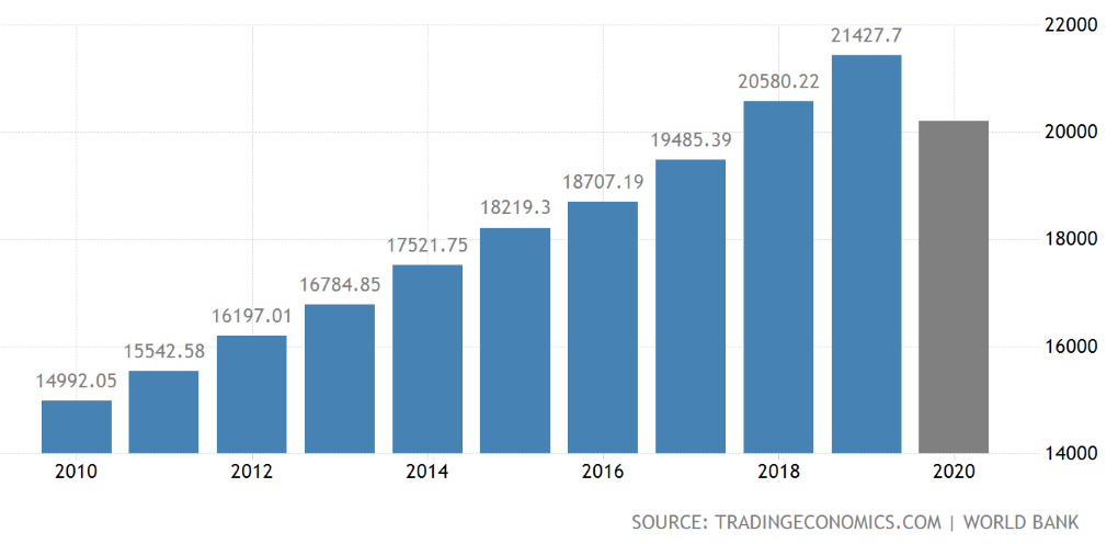
Is 2.3T $ a lot of money or a just a tip?
Well, I don’t know, the GDP of the US in 2019 was about 21 trillion US dollars (9 zeros).
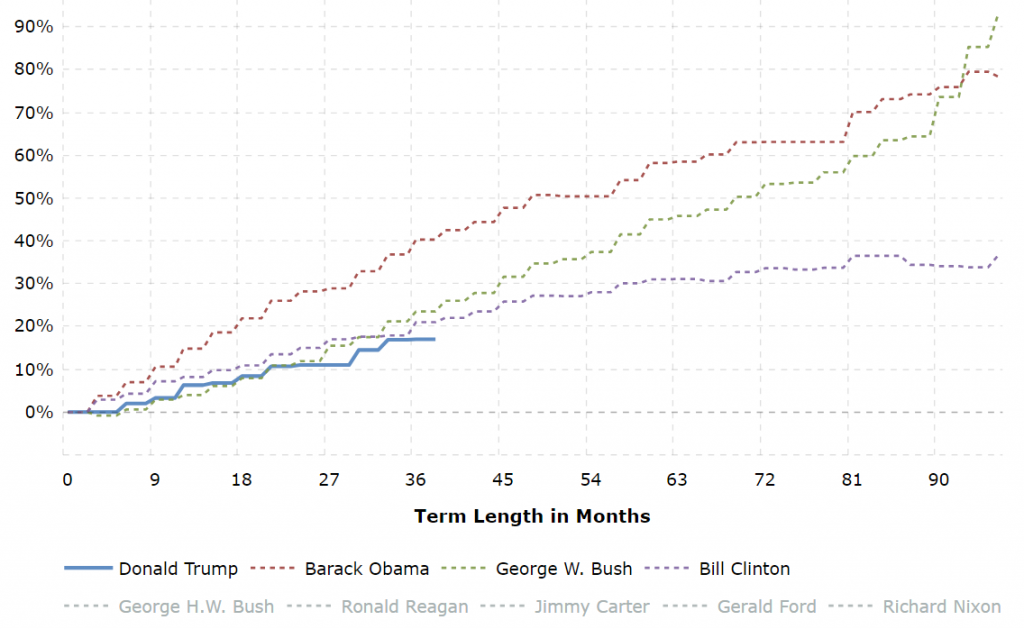
Another important piece of information is to know the impact of the debt, where Trump is not doing so badly:
The immediate questions come to my mind are:
- How long can the Fed be injecting this huge amount of money?
- Is it really that much money?
- What will happen when the numbers of POMO trades drop consistently?
More detail
The data in the green graph above where the Fed purchases in 2020 is visualized is very simple and does not tell me much. I took some time and dumped the data into a spreadsheet, and of course, you see more things.
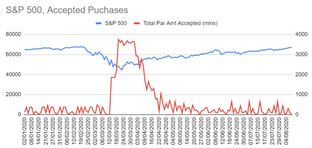
1.- March 12 was when the serious daily injection of money began.
2.- In the first half of June there was a decrease in purchases by the FED, and it caused a correction. This correction was followed by an increase in the dose.
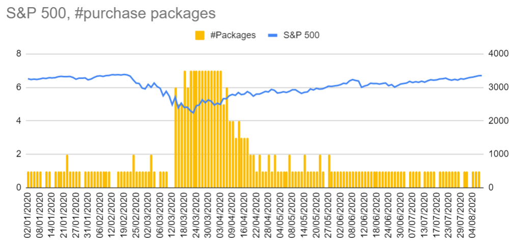
3.- The number of purchase packages is normally 0 or 1, between March 13 and April 7, it was always 5, 6 or 7 packages released. Then the FED spent a few days with 3-4 packages and returned to 1 package per day.

4.- If we divide the accepted quantities of purchases among the launched ones, it gives you the ratio of accepted purchases. I have also made the average of the last 5 days to see if there is something interesting. And if there is, when the average goes down, in a few days the market goes down (as it happened in June). Now at the end of July it has happened again, with what we see what happens during the first fortnight of August.
5.- On April 9th FED announced the 2.3T$ stimulus program. If we sum up the amount between March 13th, the first day with massive purchases, and August 6th, that is Today, then the total amount injected is 1,71T$, that supposes 75% of the original 2,3T$ budget announced.
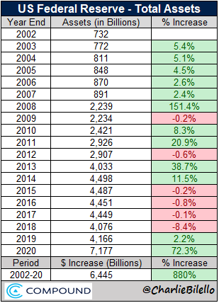
Evolution during last 18 years
I have found this table published by Charlie Bilello, where he summarizes the annual changes in the Fed’s balance sheet since 2002. Take into account that 2020 is just till 22/October.
My opinion about the POMO
This type of operation is very well known in the US. There are traders doing things with this information. For me it is something that requires data, knowledge and time that I do not have, but I always find it interesting to understand what others do, learn and understand the context where we move.
This is not, in any case, a method of saving or investing in the long term.
If there is something that I have not mentioned or is of interest, let me know!