I just learn the existence of this graphic way to show risks:

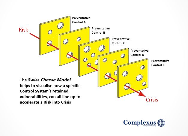
It’s a risk assessment model so you do not forget that when working with different systems, a chain of risks can turn into a issue and provoke a major impact.
The Model leverages the idea that all system controls, no matter how effective or numerous, have inherent vulnerabilities (holes), and when all those weaknesses opportunistically line up, a catastrophic failure is primed to occur.
The different risk assessments approaches I know use this same concept, but I have to admit that the visual way to show it is awesome.