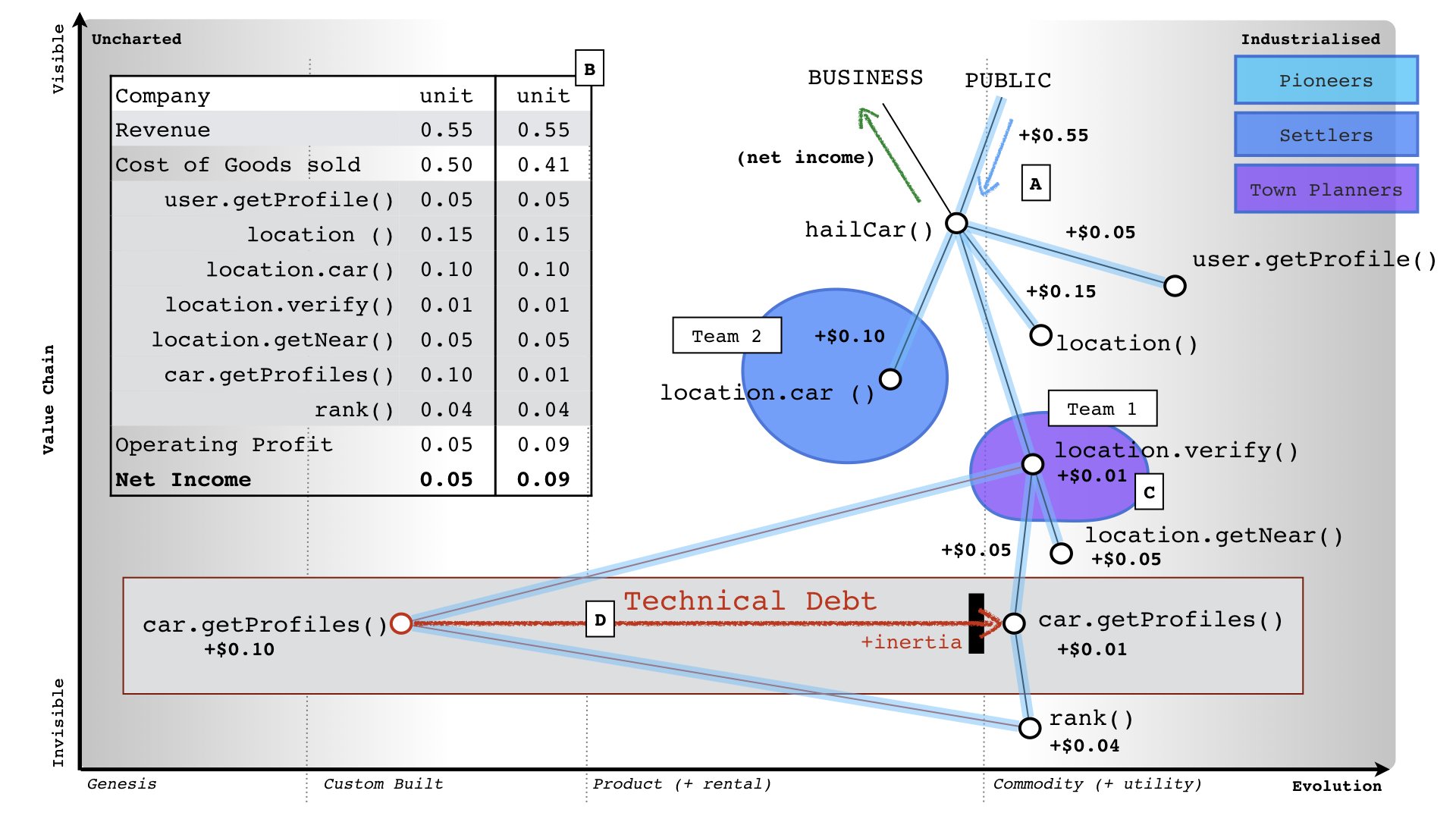
This picture below was published by Simon Wardley in Twitter and clearly reflects how maps can contribute to do economic analysis of the situations you have in a given scenario.
I have done some similar exercise with a plain table in excel with 2 columns with the scenario AS-IS and TO-BE, but this graphical representation is nicer.
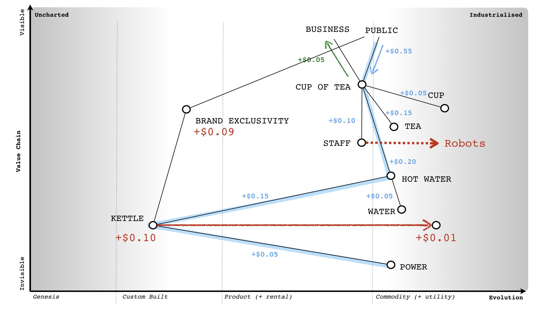
Another nice example: